What’s not to like about animation!? 🙂
Whether in film or UX design animation entertains, improves product interactions and end user satisfaction.
Equally, if used incorrectly, animation can hurt the user experience when distracting, overused and does not assist in helping the user fulfill their goals.
Before I really understood why my animations sucked, I thought if I threw in a dusting of Trapcode Particular that my audience might excuse me for my total lack of understanding of how to use animation correctly…
Take a look at the animation below. (Although a digital screen the insights can be equally applied to animation in UX design and vice versa).
In this example the animation fails to support the message and is far from achieving its goals of adding delight, personality, character and expression to the brand.
The animation feels slow, laboured, jerky, abrupt and unnatural.
How not to animate transitions which are far too slow.
When an animation is slow it feels mushy, unresponsive, laboured and delayed. It holds the user up and prevents them from doing what they want to do.
It took a leap of faith into freelance and my first of many motion design courses before I understood the basics.
I get it thanks School of Motion!
By applying the principles of animation my work started to feel right; my animations had a reason to exist and felt natural.
This article will now explore those principles that will improve the feel of your animations in both UX design and motion design.
Let’s take a look at the following 3 principles that I use most frequently:
1. Speed and easing.
2. Transitions and maintaining relationships.
3. Delight.
1. Speed and easing
Speed refers to the time that an object takes to transition from state A and B.
It might be a position change or fade for example.
According to Google’s Material Design animations should take the shortest time possible without them being abrupt or jarring.
A clean and crisp animation improves the user experience and stops users waiting.
Google’s recommended speed settings
Easing refers to how quickly an object accelerates or decelerates. By playing with both speed and easing you can create natural looking movement.
I use After Effects to create hi-fidelity mock-up UI animations and apply easing using the curve editor.
Alternatively, you can add easing directly to a keyframe by adding easy ease, right clicking the keyframe and changing the keyframe velocity amount.
As a rule of thumb, set outgoing velocity to 13% and incoming to 89%. (Fast ease in at start with a slow ease out at the end of the movement).
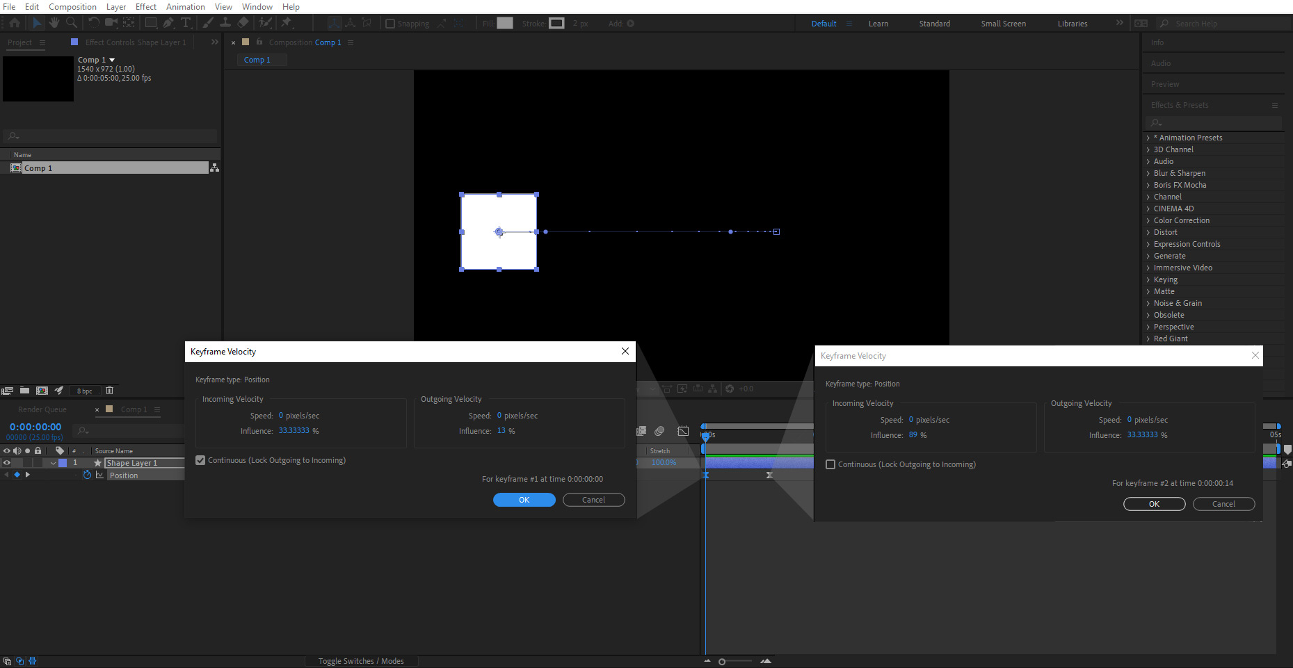
Adding keyframe velocity directly to keyframes in After Effects
Nav drawer opening and closing. A nav drawer opens over 250ms, and closes over 200ms.
The above animation shows the recommended speed of a nav drawer opening in 250ms and closing in 200ms for a prototype I created.
In this example, the animation is short and crisp so that the user isn’t left waiting, creating a fluid and smooth transition.
Speed and easing principles apply similarly to the following takeover skins for the Golf 8.
Images and text animate into place over 300ms durations with easing set to 13% ease in and 89% ease out resulting in a quick and responsive experience.
Golf 8 desktop prototype demonstrates speed and easing which is crisp and responsive.
Golf 8 mobile prototype demonstrates the correct implementation of speed and easing.
Google material speeds can equally apply to different types of animated interfaces such as the following that has been motion tracked in After Effects.
This example is fast and crisp and feels right.
Regardless of an animation's style the same Google Material Design principles to speed apply. Take the above infographic where each animation is quick.
Where the animations are slightly more complex an animation speed of 500ms can be used.
2. Transitions and maintaining relationship
When a user taps a card in an app for a more detailed view there is a transition and change of state.
With a change of state it is important to communicate that relationship with the user through animation. Why?
State changes are hard to follow and the user might not understand what has happened.
For example, a hard cut between tapping a card and displaying a more detailed view might throw the users attention because there is a lack of visual connection.
Take the following example demonstrating a parent-child transition: demonstrates how to animate this state change to maintain a clear connection and narrative between the 2 states.
Parent-child transition that maintains a relationship between state changes
The above example demonstrates:
- A clear relationship between state A and B (Card tapped to more detailed view).
- Continuity in the narrative between A and B.
- Expectation by the user that by tapping A, B would occur. This conforms to a user’s mental models.
My job as a UX animator is to provide a smooth experience for the user without interruptions where they don’t have to think too much or learn how to use something.
The following example demonstrates a zoom-in relationship.
Animating a Zoom-in relationship from parent to child.
3. Delight
Delight is a polarizing topic. You either love it or you hate it. For some users having a cute animation may add to the experience but for others it may be an annoyance and cause of friction.
When used appropriately delight puts users in an emotional flow state and they feel rewarded for tapping a button (Twitter/Facebook likes) with an endorphine high. 🙂
Delightful animations can also attract the user’s attention to do something like read some text or perform an action.
Delightful animations can attract the user’s attention to do something like read some text or perform an action.
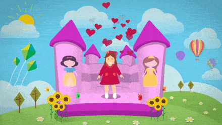
Delighting users with a cute animation can such as the waving hand can add emotion to a user’s experience with a product.
If you can get this right and marry the interaction with an emotion you can become a rockstar UX animator. 🤘
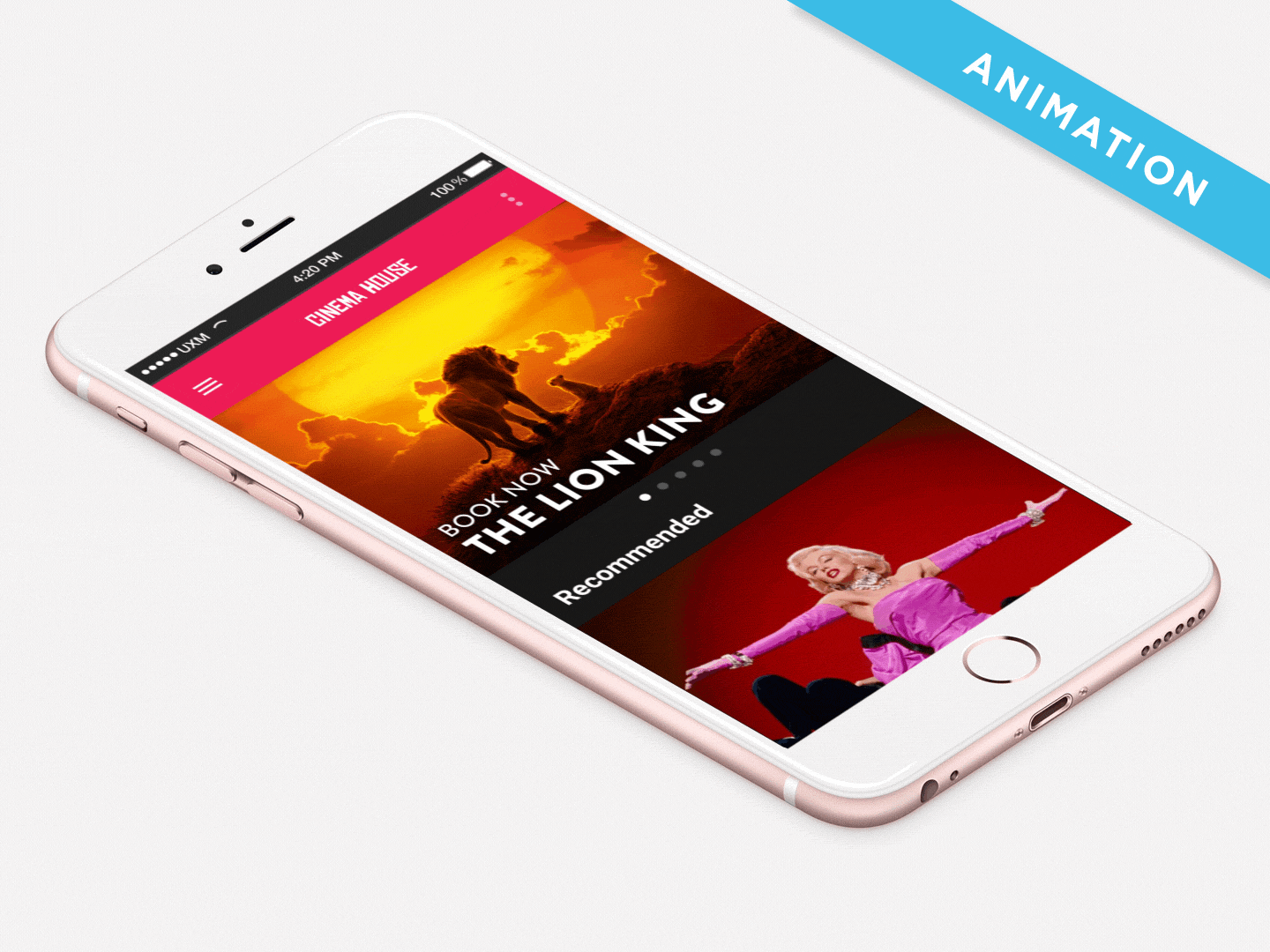
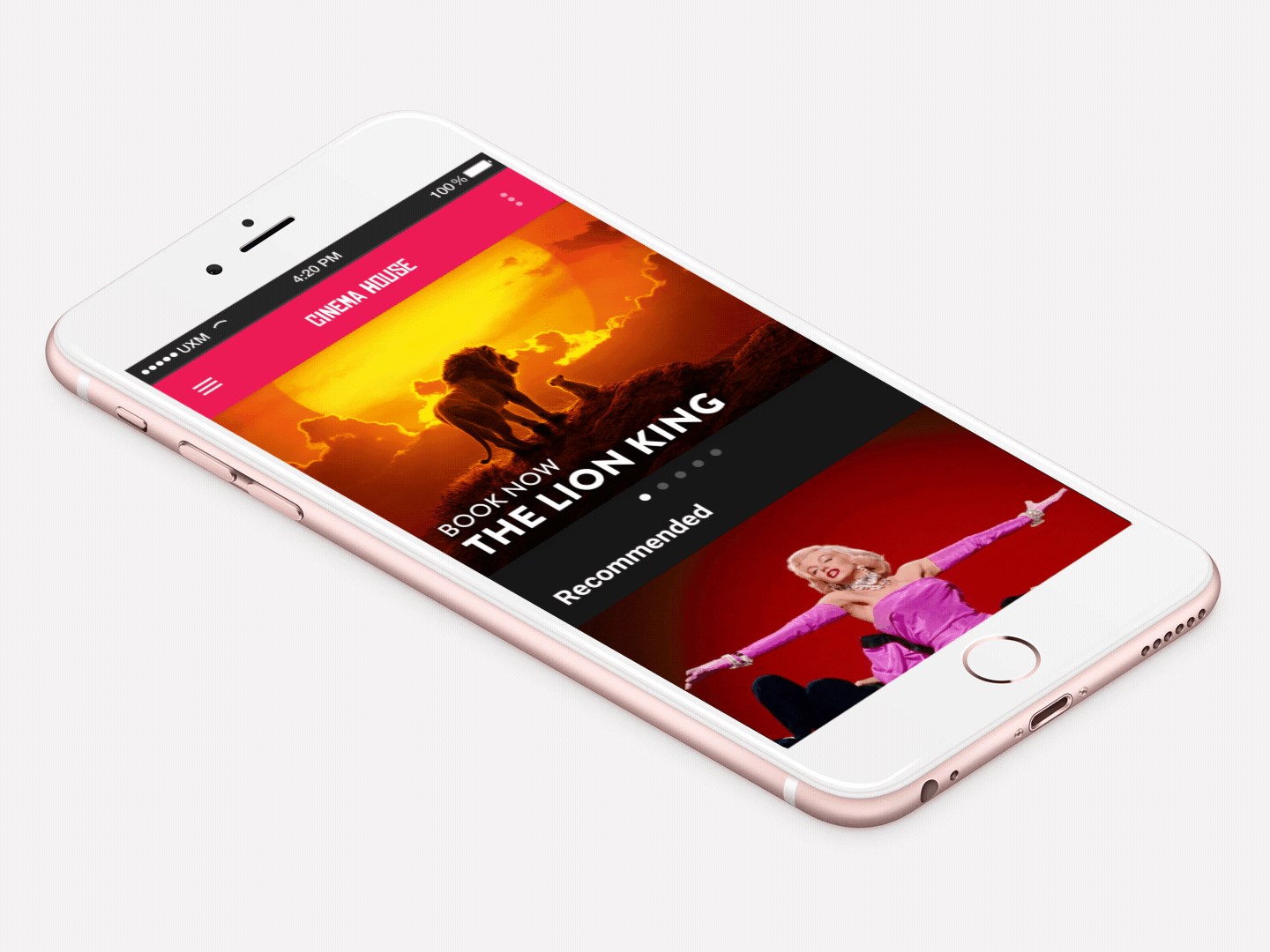
Netflix Roulette provides movie suggestions from 'spinning the wheel'.
I've applied the same speed and easing principles as detailed above making sure to maintain relationships in transitions where images Zoom-in to video prerolls and states are changed.

Making animation inclusive
Animation, Motion Sickness and Vestibular Disorder
Before I wrap up I want to talk about the negative effects of poorly implemented animation.
I suffer from motion sickness and vestibular disorders where some animation can make me feel nauseous.
I came across this website and although I don’t want to knock anyone, the experience left me feeling a little queezy.
My advice is don’t be careless with animation, use it appropriately to assist the user experience rather than using it for the sake of using it. It should serve a purpose after all.
Don't over use animation, use sparingly, and only when it helps to improve the user experience.

DO YOU HAVE A PROJECT WE CAN HELP YOU WITH?
Need a consultation? We can advise
Whatever your business needs, we’ll create a great looking website that works for you.

