WEB DeSIGN

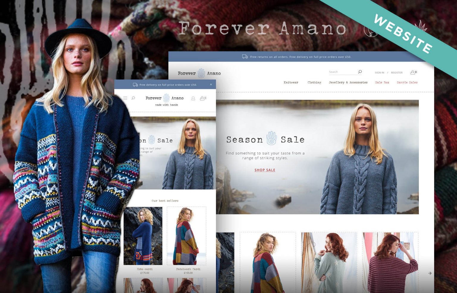
Forever Amano
UX/UI design
1 month
Forever Amano is an online retailer of premium sustainable knitwear based in the UK that was experiencing higher than average bounce rates and missed sales.
Feedback from customers had revealed that they found the homepage and product pages difficult to use and they offered little help in achieving their goal of finding something to buy.

© 2022 Forever Amano
We start our web design projects by trying to understand the problem by looking at the business goals and needs of the user.

© 2022 Forever Amano
Finding a product isn’t easy and the homepage and products pages don’t assist me with my search.

‘How might we redesign the home and product pages so that the content helps users find a product that they will buy.’
Without measurable goals its difficult to ascertain whether a project has been successful or not.
Smart goals are relevant, realistic and attainable and help guide your business to success within an agreed timeframe.
Forever Amano aimed at reducing bounce rates from their current levels to a level between 26% to 40% after 6 months of the website redesign.

What are the features or content that this website should include?
Redesign homepage and product pages to better reflect the needs of the user.


Redesign homepage and product pages for a better user experience with focus on increasing sales and reducing bounce rates.
Optimise for mobile audiences.
Incorporate best selling products/product reviews and social proof.
Build trust and confidence in the product.
Search engine optimised.
Find out more about our web design process
A Storyboard helps to understand the key moments in the user experience from landing on the website to buying a product.
It also reveals emotions that users may be experiencing and issues that can be addressed later on.

A storyboard helps to communicate key moments of a customer experience with stakeholders
(1) Our actor sees a Facebook ad on her phone and wants to find out more about the jumper from Amano.
Before redesign
(2 – 4 Bounce) Landing on the Amano product page she likes the jumper but wants to find out more about the company and its products and so navigates to the homepage.
Confused and unable to find what she needs she exits the website and goes to a competitor website where the user experience is better.
After redesign
(2 – 4 Converted) The user visits Amano and loves what she sees. She finds the website easy to use, informative and serving of her needs.
The positive experience sees her purchasing the product.
This user group was too vague and we needed to identify different user groups from which we’d write user stories.
User stories help to understand user needs and how to respond to them with features that will be included in the final design.
Because we didn’t have the budget for user research we used ‘proto-personas’ to define user groups.
8 Proto-personas based upon buyer behaviours:
This was a long list and we didn’t have time to write user stories for each and everyone so we focused on: ‘First time visitors’ and ‘Hesitant buyers‘.
Why? These users were more likely to ‘bounce’ than users who had purchased before.

Having defined the website’s users, we considered user stories to determine what tasks people may want to accomplish when visiting the landing page.

User stories help to understand user needs, pain points, emotions and opportunities and how best to respond to them as website design features.
Example user stories:
Because user needs were not being addressed by the website, users were leaving as soon as they landed, which explained the high bounce rates.
What is making users ‘bounce’:
Emotions that users need to feel when shopping:
Now that we knew why the website was under performing we could address the problem by providing a solution to the user needs.
Due to the budget constraints of the project we concentrated the website redesign on the homepage and product pages for desktop and mobile.
The purpose of the homepage is to drive traffic to conversion by showcasing products, building trust and creating return customers.
Key tasks that users need to perform:
User journeys help us identify key actions within the website and what screens to focus on first.
The core user journey is defined first. It describes what the user needs to do in order to accomplish their primary goal of buying a ticket.

User journey from homepage, product to product details.
Core user journey actions:
With the discovery stage complete we move to the visual design stage which involves the creation of sitemaps, wireframes and website mockups.

Following the core user journey we created wireframes to help communicate page layout and functionality with stakeholders and developers.
Wireframes focus on:
The initial wireframes shows early thoughts that are refined and developed as the project progresses.
Wireframe prototype for core user journey (Desktop)
Wireframe prototype for core user journey (Desktop)
The sum total of all the work up to this point. Mockups bring layout, typography and colours together whilst communicating the brand to the user.

Amano’s homepage and product pages prior to redesign

The homepage is the website shop front and is tailored to the needs of the user.
We inform, build trust and push users down the sales funnel whilst converting them into customers.
Callouts (1 - 9):
1
A standard placement for navigation conforms to a user’s mental models. Blue bar serves as information panel on company returns, delivery costs and promotions.
2
Informs the user and provides suggestions on what to buy.
3
Provides helpful suggestions on what to buy for first time visitors.
4
Sales promotions for hesitant buyers (Price sensitive)
5
Helps users navigate to main product categories.
6
Company information for first time visitors. Builds confidence and trust.
7
Necessary to reconnect with first time visitors that don’t buy. Send welcome email with 10% off first purchase to get them back.
8
Promoting UVP of quality, sustainable clothing.
9
Provides social proof and engenders trust in the brand.

With over 50 knitwear products, filtering the page based on user preferences was crucial to assist the user in product selection.
Callouts (1 - 4):
1
Used as a visual reference. Text description will be used to inform and for SEO.
2
Enables user to sort by price (Low to high / High to low), newest and ratings.
3
More powerful than sort filter helps narrow product search based on user preference.
4
High quality images, description and price. Mouse over displays 2nd image so user doesn’t have to clickthrough to see more.

The product page is the most important page on the website. It promotes the product and the company, builds trust through social proof and provides opportunities to upsell.
Callouts (1 - 6):
1
Ensure that the product meets the needs of the customer, with high quality imagery to showcase the quality of the knitwear.
2
Provides perceived value for price sensitive and hesitant buyers.
3
Product information and care to inform the user.
4
Ensures users know about delivery costs and company returns prior to checkout. (Hesitant buyers won’t get a surprise on price and abandon cart).
5
Helps buying decisions and at the same time promotes cross selling.
6
Provides social proof and fosters trust in the brand.
We created prototypes to test user interaction with the website prior to the mockups being sent to the developers.

• Prototypes test user interactions with the website and ensure there are no hidden problems.
• This approach reduces costs and saves time and is carried out before any code is written.
Bounce rates improved to a much more acceptable 30% in the first 6 months after the redesign.
© 2022 Forever Amano
By focusing on user needs we were able to significantly improve the website bounce rate by because users were no longer feeling frustrated by unhelpful page layouts and are assisted in their buying decisions by recommending product lines and reading buyer reviews.
Need a consultation? We can advise
Whatever your business needs, we’ll create a great looking website that works for you.
Be first to receive offers and latest articles
